
The Purpose of the Design
Every website design needs to have a purpose. You need to look at what your visitors need and then build the design around those requirements.
Practicality and usability should have a high priority. I have seen many corporate websites that use flashy banners and overcomplicated menu systems. While the designs looked good, they made it difficult to navigate the website. A classic case of form over function.
Bloggers frequently make mistakes with their designs too, such as adding too many advertising banners and images. These images distract the reader from the content area and increase your page loading time. It is also common for blog designs to lack important features such as a search box, archives links, and subscription links.
A practical way of reviewing what functionality your website design needs is to examine the design of websites within your niche. Break down what each design offers and what it does not. This will help you understand what works, and perhaps more important, what does not.
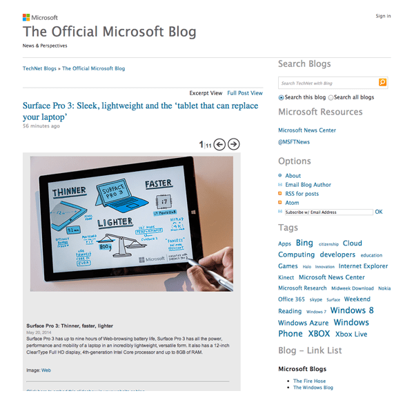
A great example of a good blog design is the official Microsoft blog. It has a clean and minimal design that is easy to read and easy to navigate. The central column displays the blog name and permalinks at the top; with posts underneath displaying large featured images.
The sidebar is a great example of what a blog sidebar should contain. It displays a search bar at the top, followed by a Twitter link, RSS subscription links, tag archives, links to other Microsoft blogs and tech blogs, and date archive links. All of this helps visitors find the information they want. There is no unnecessary widgets or banners.
When you are thinking about the structure of your website design, think about what is required, and what is not. A professional design is important; but the design still needs to be functional.
Choose Your Color Scheme
Colors play a big part on how a website is received by visitors. It is therefore important to think about color schemes when you are thinking about your logo and website design.
Gregory Ciotti published an interesting article last year that delved into The Psychology of Color in Marketing and Branding.
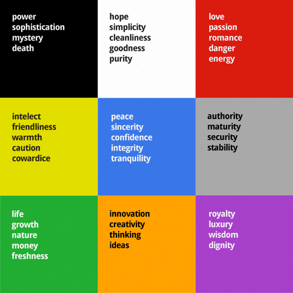
He noted that men and women prefer different colors. While blue is the favorite gender of both sexes, there was some variation in other colors. For example, with 23% of women listing purple as their favorite color, it is second in the popularity stakes after blue. In contrast, purple did not even make it into the favorite color list for men. In fact, in a questionnaire about their least favorite color, 22% of men chose purple. This illustrates that one color can attract one gender, but put off another.
Other colors are best avoided altogether. Brown and orange, for example, topped the least favorite color list for both men and women.
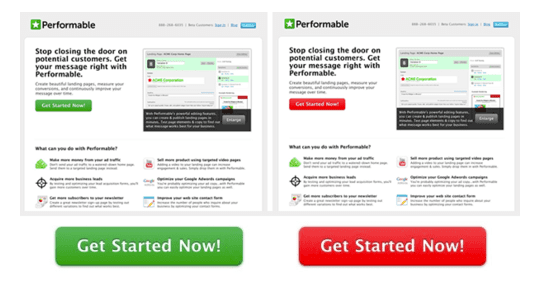
It has been shown that color schemes can affect the conversion rates of your products and services. In a case study on Performable, they changed the green action button to red. You may expect a green button to get more conversions as it usually signifies GO, while red signifies STOP; however that was not the case.
They actually found that the red button improved conversions by 21%. They believe this happened because the button color changed, but the main color scheme did not. This allowed the red button to stand out more than the green button that blended into the matching background colors.
I do not profess to know a lot about the psychology of colors myself; though it is clear that the color of your website can dictate how visitors perceive you and your company. It can also influence conversion rates. It is therefore in your interests to understand what the colors of a particular color pallete signify.
For inspiration on your design’s color scheme, I recommend checking out Colour Loversand Color Combos.
Find Design Inspiration
Looking at great designs can give you inspiration for your own project. You can find design inspiration in every day items such as magazines, business cards, album covers, book covers, and more.
If you are still struggling to find your groove, take a trip to your local art gallery or museum. The quiet nature of museums and galleries can help you block out the noise of every day life and focus on the art itself. Just sit back and be inspired ![]()
Design blogs regularly publish beautiful collections of website designs and logos. These can help you understand current trends and let you see what other website owners and designers are doing.
Below is a small collection of design blogs that I recommend checking out.
- Design Shack
- Wallpaper
- Ab
- Just Creative
- Spoon Graphics Blog
- David Airey
- Design Modo
- This Isn’t Happiness
- Creative Bloq
- The DSGN Blog
Design galleries are also a great place to view beautiful website designs. You can use the galleries listed below to view thousands of professional website designs. They are sure to give you ideas about your own project.
- Design Bombs
- The FWA
- CSS Remix
- Admire the Web
- The Best Designs
- Best Website Gallery
- HTML Inspiration
- Site Inspire
- Pattern Tap
- Awwwrds
- CSS Heaven
- One Page Love
Final Thoughts
When you work online, you cannot afford to wait until inspiration comes to you. You need to be proactive.
Review what is important to your website’s functionality and throw away anything that is not important. You can then look at examples of website designs to help give you ideas on what you can do with your own design.
If you enjoyed this article, please subscribe to the Elegant Themes blog in order to receive updates of our future articles.